Dashboard Update/Design System: Vanguard
Do you like money? If so, investing in index funds through Vanguard is widely considered a solid play in the internet money-nerd community. Vanguard has been around for almost 50 years now, manage over 7 trillion dollars worth of assets, and hardly charges anything for the service. Their founder, John “Jack” Bogle, basically invented index funds (investing in many companies at once instead of trying to bet on just one). The story behind it is very interesting, especially if you enjoy disruptive technology and sticking it to huge, fancy investment companies.
Anyway, for a organization throwing around trillions of dollars, they have a very old and outdated web presence. One of the firm’s core principles is not spending any money on frills whatsoever, so this isn’t particularly out of character, and indeed carries a certain amount of earnest charm nowadays, but I think it’s reached a point where things have probably gone too far.
The Problems
First of all, Vanguard itself agrees with my assessment. It ran a partial site redesign around 2019, and is actively beta-testing a new mobile app at the time I write this.
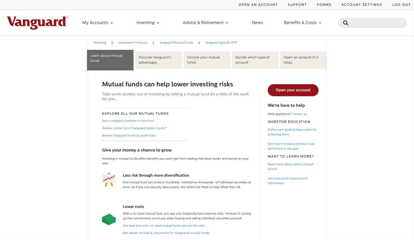
Unfortunately, the 2019 redesign was not executed particularly cleanly, and only covers certain parts of their web presence. Currently, we can see this new updated design, which looks like this:

Alongside relics of the older site design, which look like this:

So first of all, this is a very inconsistent experience. The styling is different, the typography is different, the links are different colors, the navigation components are different, the buttons are different, the layout is different. This is bad, because users need to memorize two very different websites and how they operate.
Secondly, I’d say neither design is free of issues. On the ancient site, typography is small, the hierarchy is weak, information is over-presented, user flow is not coherently planned, and components and link styles are confusing and nonstandard.

To critique the new design, again components are inconsistent, carousels are overused, there are inconsistent spacing gaps between elements and sections, and interactive elements suffer from low discoverability. For example, check out these components:


The Biggest Glaring Issue — The Dashboard
A very important part of the site is the user account dashboard. While the largest part of the Vanguard website, such as an interior pages detailing how a Roth IRA works, are probably uncommonly visited, this dashboard is a regular part of the investor experience. It’s suffering from the same basic issues as the other older pages, but it’s probably the priority to renovate. I spent some time working on an example of what an updated Vanguard dash might look like.
Problems
Making UX recommendations externally and informally, I don’t have access to many tools I’d normally use to create a a great design system. I don’t have access to their business goals. I don’t know statistics on their userbase. I don’t know common user-flows. I don’t have access to great research capabilities. I don’t know what they’re working on behind the scenes. I don’t know their engineering situation or tech stack. I don’t have access to their finance expertise.
These are all big things, but if I was really doing a dashboard overhaul and design system like this, I would be working with a full team for probably months at the very least. I’m not. I’m just doing this as an exercise based on what I can access. I’ll do the best I can situationally, and I think I can still make something relevant for my purposes. If I get hired by Vanguard, there will no doubt be many revisions.
Work Process
First Step — What are the Competitors Doing?


The Vanguard dashboard is still using their older site format. I think some prioritization of information, reformatting, and data visualization could help make it much more useful.
I want this design to represent the most current UX for the firm, and to that end I have an advantage. I can take a look at the new mobile app currently in beta testing, see what direction the company is moving, and try and incorporate that into the new designs.

Second Step — Research + Requirement Synthesis
Since I’m not at Vanguard, I chatted with two vanguard investors online to get their requests and complaints, and their most used and ignored features. I also ran a small poll on Reddit concerning dashboard preferences, which received 21 responses.
From these I collected a rough idea of what a portion of the audience was interested in, and using.
Generally, the Vanguard users I sampled were long term investors primarily dealing with index funds (surprise surprise). Almost none of them utilized the ability to trade stocks short term or exchange other financial products on the Vanguard platform. On average, they processed a transaction only every 6m, with many closer to years. They occasionally used the dashboard to manage and transfer funds between accounts, regularly but infrequently to buy more funds, and rarely to sell assets. When users of multiple platforms were asked about preference, most preferred Fidelity and Schwab’s dashboards.
As long-term investors, the most regular use of the dashboard was just to check in and keep tabs on investments, and to see performance statistics.
To this end, my priorities for the dashboard UX were to maintain transactional functionality, but primarily to present investment status at a glance visually with some drill down analysis available.
Third Step — Roughing It
I like to do lo-fi digitally. I’ll make a bunch of labelled boxes and just move them around until things seem to fit. It’s just like paper drafting but I can resize the pieces of paper if I want.

Fourth Step — Building Components

For the hi-fi prototype, some of the components are unique (such as the account value graph), but most are reusable and/or share a external frame. As an exercise for myself, I tried to make all of the components resizable and used Figma’s auto-layout functionality as much as possible.
At this point in the process I cranked out a preliminary dashboard, and decided to take a little detour. Since I was building reusable components for the dashboard, why not take a pass over the rest of the site and systematize it to help keep the experience consistent?
Fifth Step — Detour, Systematizing the Old Site
Since this is my own project, I get to decide what I play around with. I decided to explore some of Figma’s more recent features by distilling the old site layout into a library.
In the real world, this might be useful for a large business such as Vanguard. Moving from one design to another can be a long and laborious process. Some advantages of having a prototyping library for the current page design are that it:
- Makes it easy to mock up new content which must be added before a full redesign.
- Establishes a library of necessary features and components that must be upgraded for the redesign.
- Consolidates messy or disorganized features of the current design (reduce the number of type styles to the minimum needed etc.)
- Provides an easily swappable prototyping environment where new components can be quickly swapped in for progressive improvement.
- Standardizes existing pages so inconsistencies such as spacing or font/ unusual components can be easily brought into compliance without designer consult.
- Establish upgraded components which work throughout the site, which can then be used on the dashboard while maintaining consistency.
I went through the older site and converted it into a small responsive prototyping design library. Boiled down, it’s not tremendously complex.
We have some buttons and controls, which I can simplify into only a couple variants, and a set of navigation elements.


There are a few reusable cards and type format sections…

Some spacers and dividers, and some graphical backgrounds from the new mobile app design which I recreated in vector format:

Then I just needed to establish a set of new typographical styles and a color library extracted from the old site. There are a really large variety of colors in use currently, and this should probably be simplified and considerably on a later pass.


Sixth Step — Using the New System
Let’s take this library out for a spin and remake an existing page of the site with the new components. This should look pretty close to the old page, but is entirely made of new snap-together components.

The notable changes made are:
- Responsive full width top bars
- Links standardized to blue, consistent with redesigned pages
- Reduced number of type styles
- Standardized button styling consistent with newer redesign

The major change though is behind the scenes, where everything is a reusable style or component. Content can be swapped or rearranged without disrupting 8px grid spacing or the document flow. Hurrah!
Now that this is setup, we can simply swap some of the ancient components with the new components used in the existing web redesign (such as the odd tab squares → material style tabs). Stretch out the central content column, and give everything a ton of space to make the old page much more consistent with the new pages already in use. I also threw in one of the new dark graphic backgrounds used in the new mobile app. Quick and easy! Here’s the old page, given a facelift:

Despite still having the same general content and layout, it’s much more consistent with the new styling. With the addition of some photos and a splash of color it would be much better, but this is what’s possible just quickly restyling already existing content. Now we don’t have the site split between white/rainbow wide pages with blue links, and tan/red narrow pages with orange links.
Seventh Step — Using the System to Make a New Dashboard
Cool. Now that our design language is codified, I can take these components and styles back and incorporate them into the new dashboard I was laying out before. Again, here’s the old dashboard for comparison:

And here is the new concept:

I’ve added a large, long term visualization of portfolio value on the main section of the page. This supports the user goal of checking in on investments at a glance, and the long term focus supports Vanguard’s goal of guiding investors into long investments. The scale selector in the top right is now a site-consistent modern sliding selector congruent with the button stylings.
Above this selector is a slider to toggle display of all change versus market change. Without this option, if you deposit more money into the account and cause it to double in value, the dash shows that your account grew 100+% this year. With this option toggled “on”, you get to see that your investments actually grew a more reasonable 7% (for example) due to market performance that year. If you’re checking on if your investments have grown, you probably want this option on, and if you’re checking to see your progress towards retirement, you probably want it off. This is an often requested feature, and one already incorporated in the beta version of the new mobile app.
The left lower panel is a multipurpose panel which switches between functions using the same standard tab system used throughout the new site.
All panels have a consistent “Details” link which leads to more detailed drill-down information about that panel, and more options. The dashboard has been stretched responsively to full width to take as much advantage of available screen size as possible, and avoid having to split high value information between multiple pages.
A tremendous amount of options and information has been removed from the primary dashboard view, such as links to investment guides, tips on cost basis and portfolio balance, and numerous advanced view options. Some of these would no doubt be retained in a deeper menu system, and some would be removed based on consult with financial experts and larger user studies.
Conclusion — Wrapping Things Up
That’s as far as I’ll go for now, as any further revision without user testing and expert consult is likely to be pretty low value. To recap, I:
- Got annoyed at Vanguard’s current dashboard
- Researched dashboard user preferences
- Started redesigning the dashboard
- Decided I might as well establish a design system for the rest of the site too
- Tried out some cool new features and advanced component design techniques in Figma
- Standardized and restyled the older site pages using the new design system
- Used the new design system to create a hi-fi new dashboard concept
It was an interesting journey. I learned a lot of interesting things about Figma, such how fancy you can get with variants, responsive auto layout, and nested component architecture. I also learned why it’s not always a good idea to get that fancy. It’s good to dive into things like that when you have the time, and you’re not in crunch mode trying to deliver a critical project.
Anyway, can’t wait till Vanguard updates that dashboard.
